When it comes to building a brand, most people think about logos first. But here’s the secret: your fonts and colors are just as important—maybe even more! Fonts and colors are foundational elements that shape how your brand is perceived. They do more than decorate your website or social media accounts—they communicate your brand’s unique personality and set the tone for your audience’s experience. When chosen thoughtfully and applied consistently, fonts and colors create a cohesive look that builds trust, make your content instantly recognizable, and reinforce your story, message, and mission.
Why Fonts and Colors Matter for Your Brand
Fonts and colors are powerful tools to express your brand’s personality and emotions visually. They act like the “voice” and “personality” of your brand, and keeping them consistent is what helps people remember you.
Colors play a key role in setting mood and perception based on your audience and what your brand stands for. Once people start associating a certain color palette with your business, they’ll recognize you instantly—even before they see your logo.
Different fonts can evoke feelings from professionalism to friendliness, creativity to reliability. Think of fonts like someone’s handwriting or tone of voice. A playful, bubbly font makes your brand feel fun and casual, while a sleek, simple font feels modern and professional. If you constantly switch fonts, it’s like changing your voice mid-conversation—confusing and distracting!

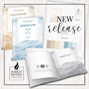
Creating Your Own Style Guide
A well-designed style guide or brand board or kit keeps all your design essentials—fonts, color palettes, logos, and more—neatly organized in one place, along with clear guidelines for how each element should be used.
If you’ve purchased a full brand identity package from a designer, you likely received a style guide that indicates the fonts and colors used in your branding. However, if you are generating these pieces on your own, you will want to be strategic with your selections.
Here’s how you can build your brand kit easily:
- Identify Your Brand Fonts and Colors: Choose fonts that reflect your brand voice (a clean sans serif for modern brands or a warm serif for a more traditional feel). Pick a color palette with 3–5 harmonious colors for main, accent, and background use. Get a feel for stock images that represent your brand well.
- Use Canva to Build Your Kit: Canva offers a user-friendly interface for creating a digital brand kit. Upload your logo, select your brand fonts from Canva’s font library or upload your own if you have Canva Pro, and define your color palette with branded hex codes.
- Customize Image Templates: In Canva, you can also create branded templates for social media posts, blog covers, and email headers. Use your brand fonts and colors consistently for a professional, cohesive look that saves you time in content creation.
Recommended Free Resources for Fonts and Colors
- Fonts:
- Google Fonts: Extensive free web font library; easy to implement in content editors like Kadence or Canva.
- Fontshare: Modern, stylish open-source fonts perfect for web and print.
- Font Squirrel: Handpicked commercial-use free fonts with a font identifier tool.
- Colors:
- Coolors.co: Fast and easy color palette generator with customization and export features.
- Canva Color Palette Generator: Great for discovering harmonious brand colors and applying them directly in your design workflow.
- Design Seeds: Nature-inspired palettes updated frequently for fresh inspiration.
How to Apply Brand Fonts and Colors to Your Website and Content
- Use your brand fonts in your content creation platforms, like blog editors or Canva, even if your website theme has limited font customization. (Or, reach out to a web designer—like us—for a brand and theme refresh!)
- Define font hierarchies: Headings, subheadings, body text, and accents each use a selected font style or weight for clarity and visual interest, in your social media graphics and/or downloadable products just as much as in your website design.
- Stay within your chosen color palette in your blog posts and site pages, for buttons, links, highlighted text, and images to maintain consistency and recognition of your brand.
Quick Tips for Creating or Implementing Your Own Style Guide
- Limit font choices to 2–3 to avoid visual clutter.
- Choose accessible fonts that remain clear on different screen sizes.
- Use different font weights within the same family for flexibility.
- Pick a dominant brand color and several accent colors that complement well.
By focusing on how each brand element translates into your website and social media visuals, you’ll create a cohesive experience for your audience—and with just a little discipline, your brand will look polished and professional without the need for a design degree.
Let us know if you find these tips and resources helpful on your branding journey!
This post may contain affiliate links. Read our full affiliate disclosure here.