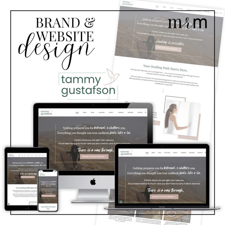
We have had the privilege of partnering with Tammy Gustafson—a speaker, author, and guide for women healing from betrayal trauma—several times over the last eight years. Tammy’s work is built on truth, not perfection, and her voice has become a steady anchor for women walking through some of the most painful chapters of their lives. With a growing platform, a new book release, and expanding programs, Tammy came to MRM this time with the desire to strengthen her personal brand and create an online home that reflects both her personal story and the brave path she leads others along.
Our team stepped in to support her rebrand and redesign, which included messaging updates and an SEO strategy. The outcome is a gorgeous new website that brings together all the elements of her work in a cohesive, courageous, deeply human identity.
About This Recent Project
As Tammy’s platform has grown over the last few years, so has the complexity of her online footprint. She has maintained multiple domains, primarily TammyGustafson.com and BetrayalHealing.com, each holding valuable content, audience familiarity, and search equity. But the fragmentation made it harder for visitors (and Google) to understand her core identity. People were looking for Tammy, not just one event or course.
Our recent project focused on centering Tammy as the primary brand, with Betrayal Healing positioned as a sub-brand, both encapsulated in a trauma-informed, grounded visual identity. Through our collaboration, we aligned her presence, strengthened her messaging, and created a cohesive, scalable ecosystem for everything she offers.


Swipe to See the Before & After!
Brand Strategy & Design
Before we could begin with the visuals of Tammy’s reimagined brand, it was necessary to define it. Her existing brand presence was built around the tension between her strength and femininity, as a woman who rides Harleys and skydives yet leads others with great compassion, honesty, and tenderness. This duality of her platform shaped every strategy and aesthetic decision we made and became the creative spark for her entire visual identity.
From the start, it was clear that Tammy’s redesign and rebrand needed to hold both strength and softness—reflecting not only who she is, but also the women she serves. Karen developed a brand strategy and the emotional framework that reinforced this foundation. With Tammy’s approval of the strategy, Karen then crafted a new brand that embodies grounded authenticity, strength balanced with compassion, and a sense of freedom and movement. Minimalist bird and line-art elements subtly symbolize what her work makes possible the ability to move, rise, and reclaim oneself.
Visually, Tammy’s palette leans into muted neutrals, soft greens, hints of black and grey, and restrained Parisian tones—colors chosen intentionally to reflect calm, stability, and emotional clarity becoming overly feminine. These choices directly reflect her values of authenticity, grit, and emotional freedom, and support Tammy’s slight shift from the Betrayal Healing identity toward a unified personal brand. The typography reinforces that clarity, pairing elegant serif headlines with modern sans-serif body fonts to provide both authority and approachability. Generous spacing and minimalist line textures create a sense of breath, movement, and room to heal.
Warmth, honesty, and emotional steadiness guide both the visuals and the voice. With the new brand strategy in mind, Beth refined Tammy’s website content, optimizing the page flow and calls to action to focus on all four phases of betrayal healing and their corresponding resources. Staying true to Tammy’s voice, the page copy was elevated to provide the same validation, compassion, and gentle movement as the visuals of the website.
From her logo to her color palette to the tone of her messaging, this cohesive brand system became the foundation for her website, her resources, and the evolving ecosystem of her work moving forward.
Website Design and Development
The new WordPress website was built to reflect Tammy’s compassionate presence while guiding visitors through a gentle, intuitive user journey. From the earliest stages of development, Karen and Mandy shaped the design around three core objectives: clarity, safety, and guided movement. We wanted the site to clearly establish Tammy as the central brand and expert guide, create a calming and spacious environment for emotionally tender topics, and offer thoughtfully designed paths into her book, resources, retreats and conferences. These goals informed every structural and visual decision, supported by intentional imagery featuring real women, expansive landscapes, Parisian architecture, and subtle symbols of movement.
To support Tammy’s expanding role as an author, speaker, and mentor, the website underwent a full brand architecture restructure to position TammyGustafson.com as the primary hub of her online presence. Dedicated pages were created for her book and speaking opportunities, and we established content silos for the courses and events based on the healing phase they serve. Integrated SEO schema, strategic internal linking, and high-performance page structures strengthened her visibility, and the thoughtful user-focused design flow ensured clear next steps for women in crisis or transition.
As part of the broader strategy, we also addressed the future of BetrayalHealing.com, a site with strong historical value but fragmented brand alignment. Rather than retiring the domain, we recommended maintaining a simple, branded landing page that directs users seamlessly into TammyGustafson.com. This approach keeps the traffic and name recognition Tammy has already built, without spreading her brand too thin across multiple websites. The Betrayal Healing landing page now serves as a simple, familiar starting point that guides visitors straight to her main site. It still shows up for people who search for her older content, but it now strengthens—rather than competing with—her long-term brand under her name.
The result is beautiful and functional solution that honors Tammy’s audience while fully centering her future on a unified, personal brand—one that is clear, courageous, and built to grow with her mission.
What Tammy had to say…
“Wow. As I read through each design description I was deeply impressed. You get it. And you articulated the vision and nuances well. Thank you for all your great work. I appreciate all the deep thought, intention, and explanation. The overall design looks great, very appealing, and flows well. It’s fabulous.”
Services Included in this Project
- Brand Strategy and Identity Kit Design
- Sitemap Planning and Content Development
- Custom WordPress Design and Development
- Ongoing Tech Support

Team Members Involved
 Beth Hess
 Karen Lewis
 Mandy Roberson
Find out more about these ladies and the rest of the team here at MRM: Meet the Team
This post may contain affiliate links. Read our full affiliate disclosure here.


