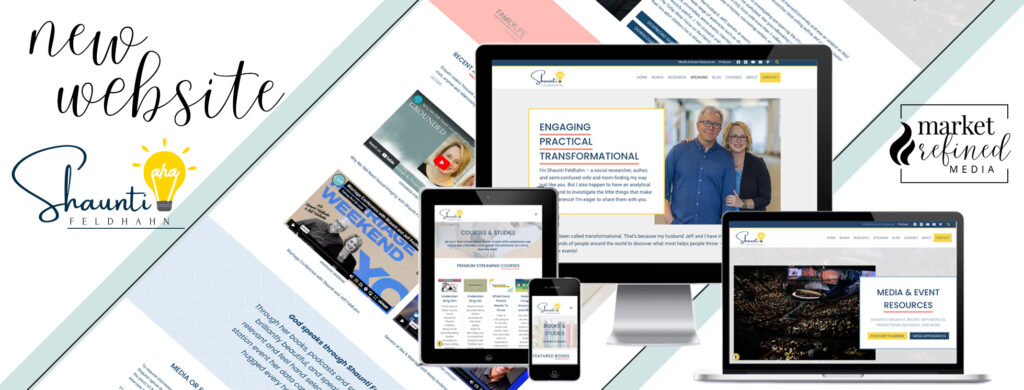
Shaunti Feldhahn is a well-known author, researcher, and relationship expert offering churches, corporations, universities, and youth camps practical and applicable insight that has been dubbed as “transformational” by many.
We’ve had the pleasure of supporting Shaunti’s busy team in a variety of ways over the years, including site care and routine tech support to keep her slightly older website online and functional. At the end of last year, it was collectively decided that it was past time for an overhaul of the old website, which was no small feat, and our team thoroughly enjoyed trimming down the sitemap, refreshing the design, and creating a user-friendly and beautiful new online home for Shaunti’s books, resources, and outreach.
About This Recent Project
Research and Planning
Over the course of six months, Mandy met with two of Shaunti’s team members to research and document all of the old website’s sitemap and information. This helped us determine what pages were duplicate or no longer relevant and what details could be updated, redirected, or condensed. As is often the case when a ministry or business team is involved, there was a great deal of duplicate content throughout this website, as well as the separate sites Shaunti has for her books and studies, and we wanted to be sure to address all of that during our work, so the website would not be penalized in any way going forward.
We combed through the older plugins and heavily custom-coded theme to be sure we replicated all expected functionality and flow while also eliminating any unnecessary bulk on the backend as we updated to more current softwares. The time investment was significant for this phase of work, but the reward in the end was so worth it! All of the preparation helped the design go much more smoothly and guaranteed a much lighter-weight, healthy website in the end.
Website Design and Development
Shaunti provided us with the new brand design to incorporate into the site design, which helped marry the branding from her Surprising Hope website and resources with her personal and ministry brand. Our associate Karen worked with Shaunti to refine the new brand board that would establish the color palette and overall look and feel of the new website.
Once the brand board was approved, Karen moved on to creating an on-brand homepage design, reflective of Shaunti’s priority content and design requests that also met current industry standards. After a few revisions and additional discussions surrounding user-experience and functionality, the front page of the new site was approved and developed on our staging site. Karen and Mandy then worked through the remaining key pages of this new website together, tag-teaming on the design and development tasks and gaining Shaunti’s team’s approval at each step. The About and Media pages in particular were optimized for event planners and media connections, placing all pertinent information at the visitor’s fingertips, allowing the website to now be a vital part of Shaunti’s ministry team.
Part of the rebuilding process involved removing the dated Beaver Builder theme and tools and converting all pages and posts to a new Kadence child theme and the native Block Editor for WordPress. Thanks to the new tools available to us in Kadence, we were able to rebuild Shaunti’s large Resources area of the website so that it better serves the end user and allows the ministry team to sort and organize existing resources and content more effectively. It’s also important to us to equip each client to be able to make website updates and additions on their own in the future, so we created reusable templates (or “patterns”) in the site that Shaunti’s team can easily repurpose for any new book releases. We also utilized Loom videos as a great way to navigate client education and feedback through this process, both saving us time and providing longstanding resources for the client. Shaunti and her team have an entire library of custom video training for using their new website as well as for our recommendations for best site and content practices going forward.
Tying up this project, we completed basic SEO updates prompting Google to reindex the finished sitemap and updated content, along with adding an accessibility widget and updated privacy and data settings. The sitemap was reduced from approximately 160 pages to 16, and many unnecessary database tables and files were removed, resulting in a much lighter site and faster load time. We also set all necessary page redirects for the removed or combined pages to be sure there are no Google penalties for 404 (broken link) errors. The new site is already scoring much higher in search results and page tests, and we couldn’t be more pleased with the outcome.
The site now has a very fresh, clean and user-friendly design and flow. We look forward to watching Shaunti and her team make good use of this new online home!
What Shaunti’s team had to say…
“We LOVE it!!! Thank you. We really appreciate the extra work that you did to make it look amazing and operate so smoothly . . . Our entire team is impressed with the new website design.”
Services Included in this Project
- Sitemap Organization and Restructuring
- Custom WordPress Website Design and Development
- Removal of Beaver Builder Page Builder
- Training for Gutenberg Block Builder
- Ongoing Tech Support and Hosting

Team Members Involved
 Karen Lewis
 Randi Avant
 Mandy Roberson
Find out more about these ladies and the rest of the team here at MRM: Meet the Team
This post may contain affiliate links. Read our full affiliate disclosure here.


